Mathway Redesign @ Chegg
Role: Product Design Director
Timeline: 2022-2023
-
Problem Statement
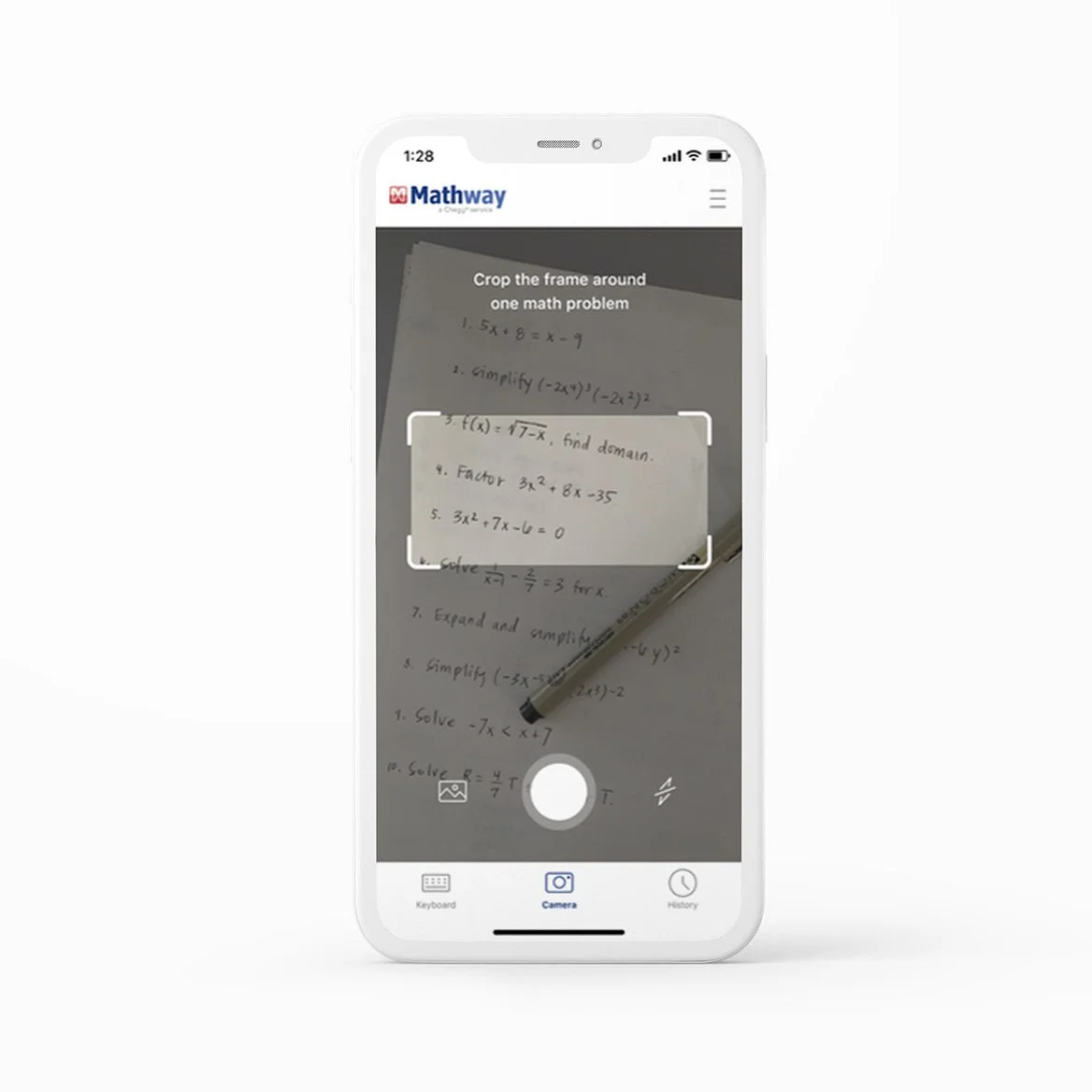
User research and usability benchmarking showed 35% of the Chegg Mathway native app users did not use the camera OCR functionality, a key feature in submitting complicated problems into the tool. Because of this there were 155% more errors than our competitor resulting 15-33% longer time to submit problems. Problem statement: students have discoverability and usability issues with the Chegg Native experience, leading to business performance erosion.
-
Challenges
No central point of contact.
Engineering not used to working with design timeline. -
Guiding Questions
How might we...
...give students an easy way to input problems using their phone’s camera?
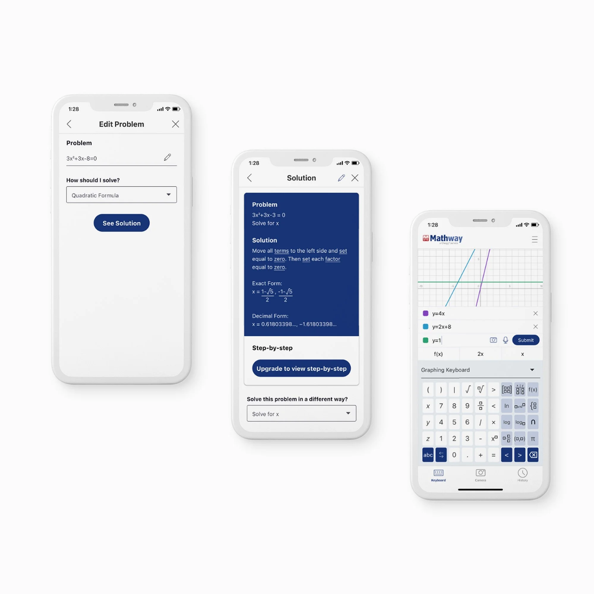
... allow for a simple way to let students re-enter problems they previously asked?
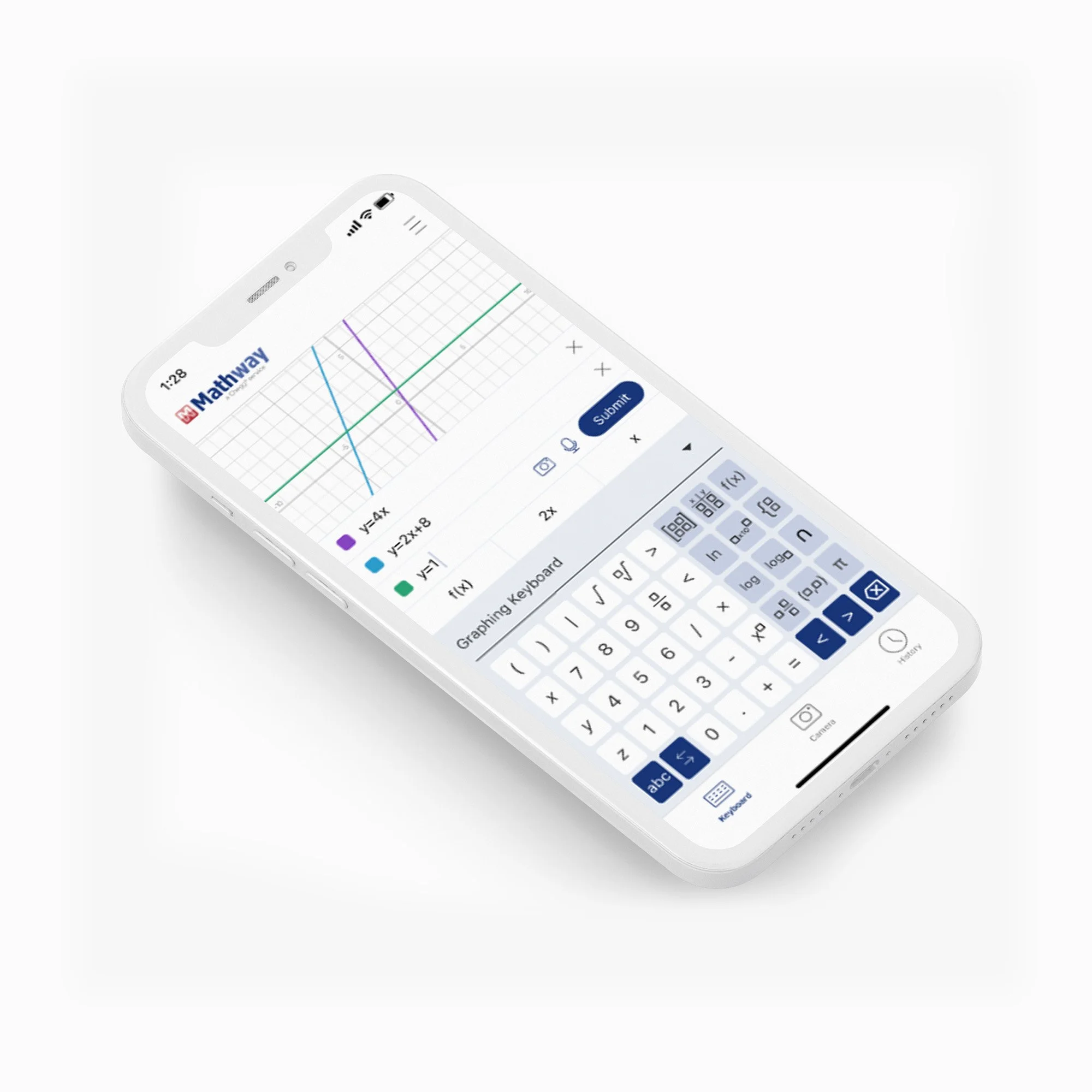
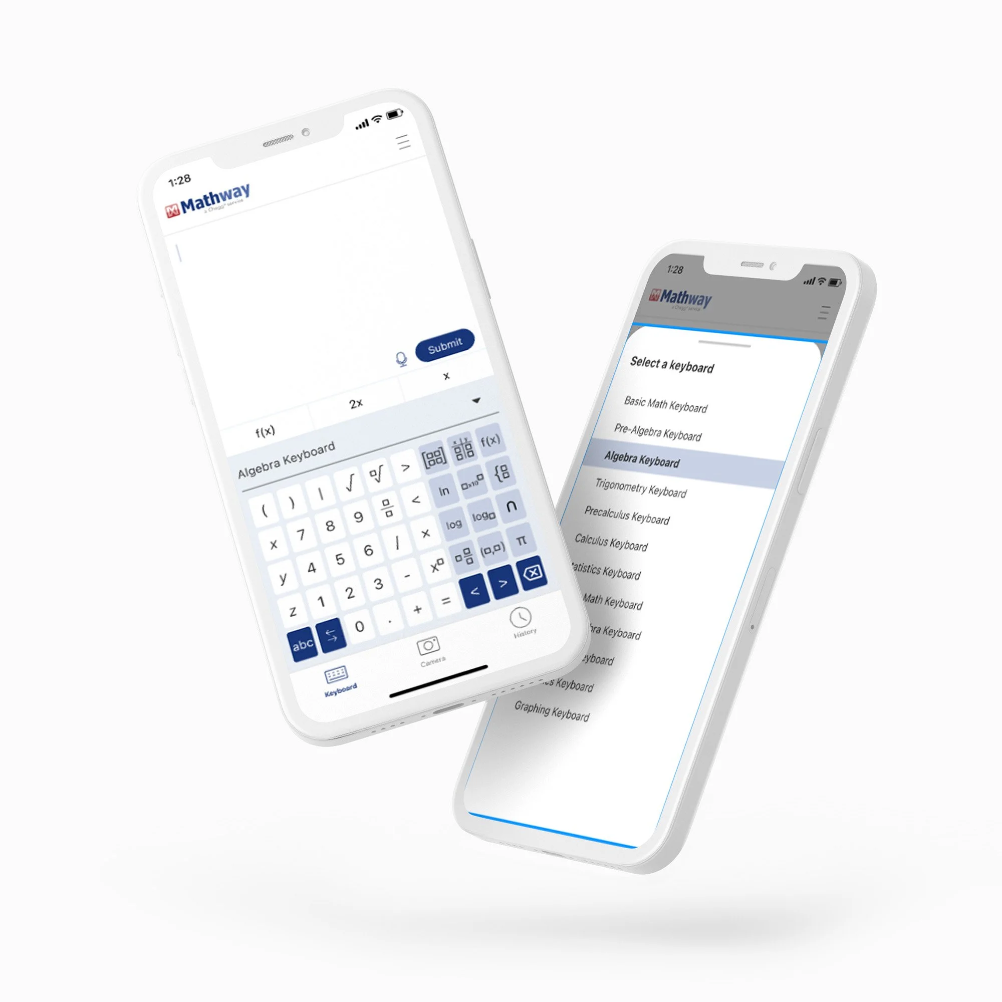
... let students adapt the keyboard to their current subject?
... make sure students need to understand the solutions they are given?
-
Actions
My design team jumped to work focusing on the improvements they could make based on the data.
The lead designer took on the role of both PM and designer. We communicated daily with the dev team in Israel.
We allowed for a simple way to let students re-enter problems, let students adapt the keyboard to their current subject, and made sure students understood the solutions they were given
We tested our product with different students through moderated in-person testing. We took the qualitative data and made three iterations of the app, resulting in the final product.
-
Solutions
Sr Designer also because an impromptu project manager
We met with engineering on a more recurring basis and made sure to include them in testing result reviews. Ultimately I met with their director and communicated the need for engineering and design to partner more. This resulted in weekly reviews that improved our back and forth iteration.
We broke up the project in terms of MVP vs Phase II. After our weekly reviews were established we were able to deliver items incrementally based on what engineering needed next.
-
Recommendation
A seamless flow that minimizes errors
To inherently communicate Mathway’s value through ease of use and simplicity
Allow for a simple way to let students re-enter problems
Let students adapt the keyboard to their current subject
-
Results
We tested our product with different students through moderated in person testing. We took the qualitative data and made three iterations on the app resulting in the final product.
One-month post-launch CVR lift for iOS was estimated to be 58-78% and Android was a 126% lift.
Problem submission - a key engagement driver - showed a positive lift of iOS at 7% and Android at 23%.


